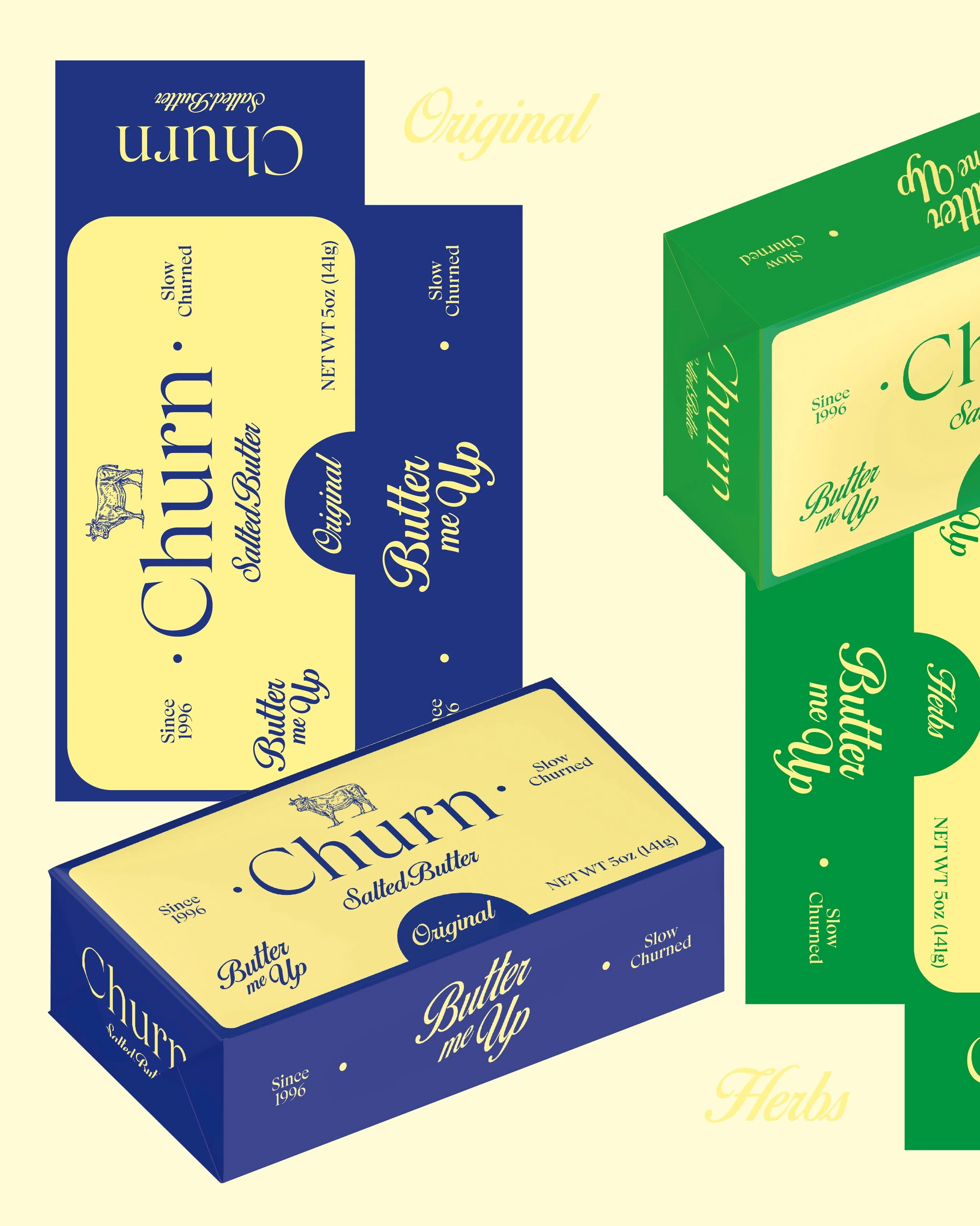
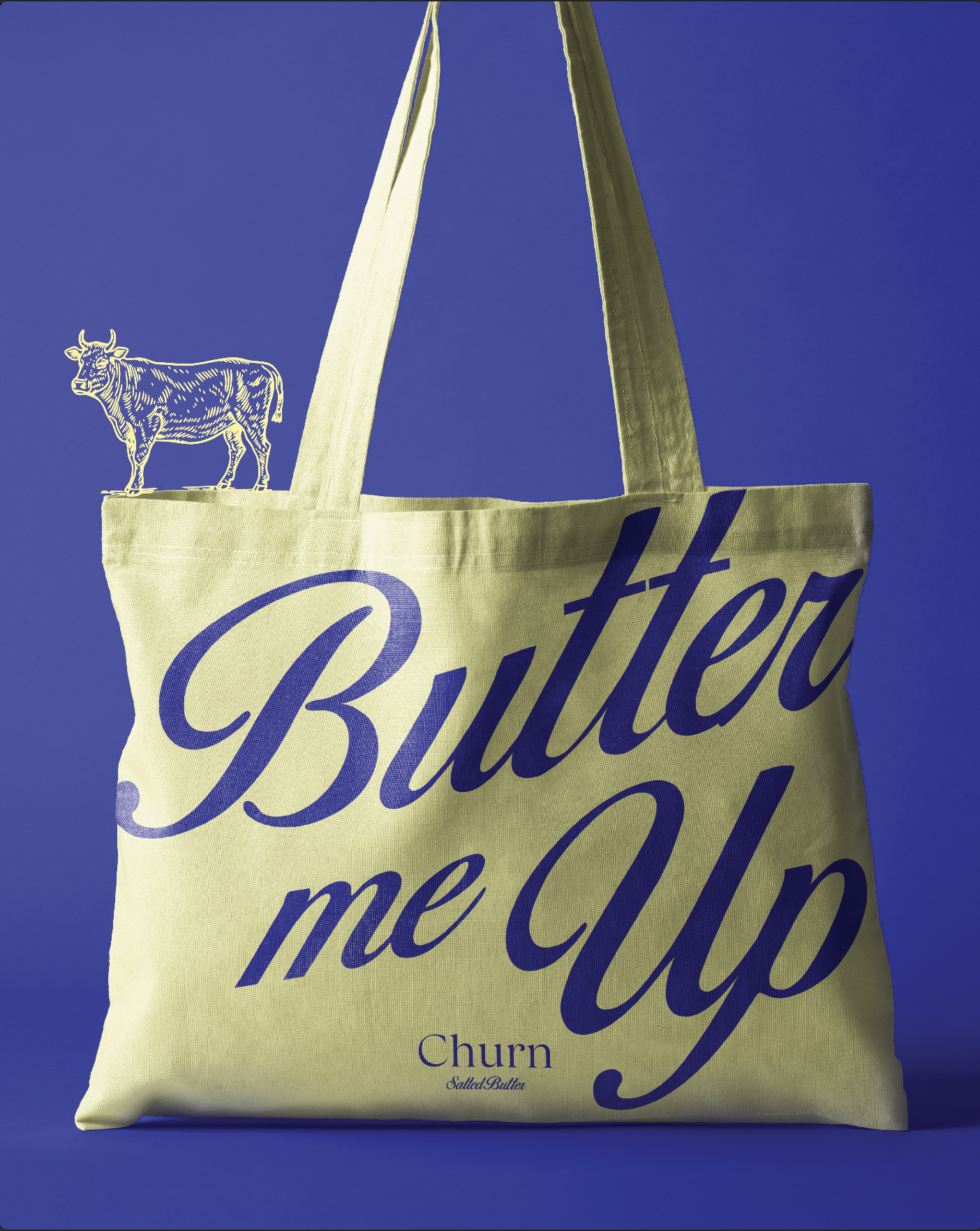
Churn
Using solid colours and retro lettering paired with a chic serif logo to strike the right balance between timeless and modern. The clean, bold approach feels both nostalgic and contemporary, giving the brand staying power that won't look dated in a few years. The combination of vintage-inspired typography with refined serif details creates packaging that feels classic and premium without being stuffy or overly trendy.